Client: Sandu Publishing Co., Ltd. (Guangzhou, China) / Year: 2010-2012
Initiated by Sandu Cultural Media in Guangzhou, China, 360˚ shop is a new concept store derived from the Concept and Design Magazine Design 360˚.
The new concept shop was opened in Beijing 798 Art Zone in Autumn 2010 and Guangzhou Red Factory in Spring 2012 respectively, aimed at promoting the new young Asian design talents’ products and brands via different exhibitions and seminars. The shop is a new platform for young talents to showcase their works for sale.
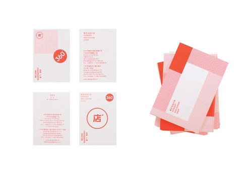
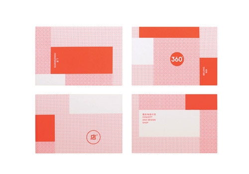
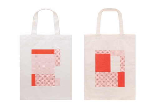
We were asked to lead the new branding for the shop including naming, positioning and marketing strategy, identity, prints and packaging.
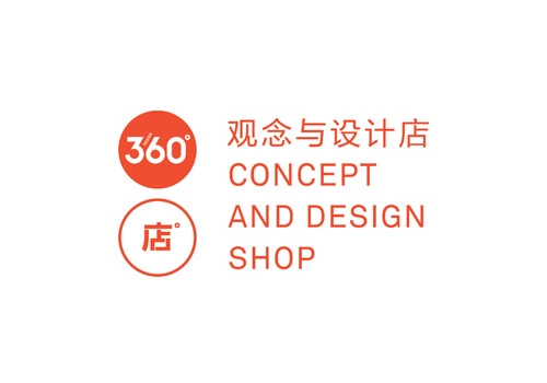
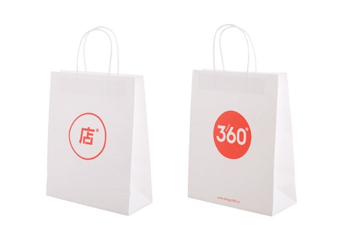
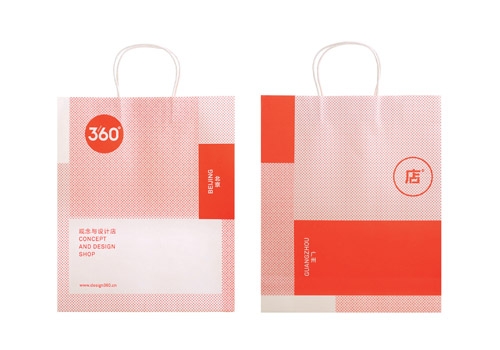
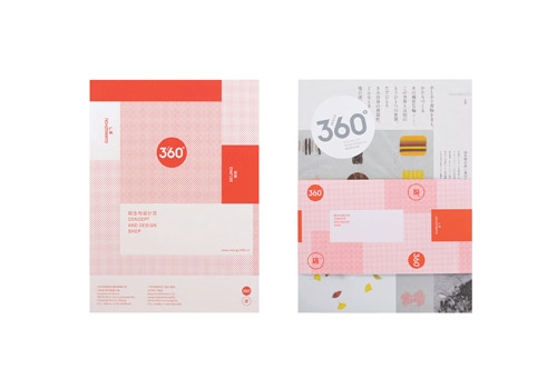
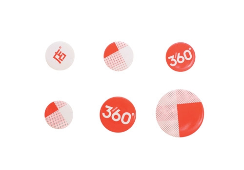
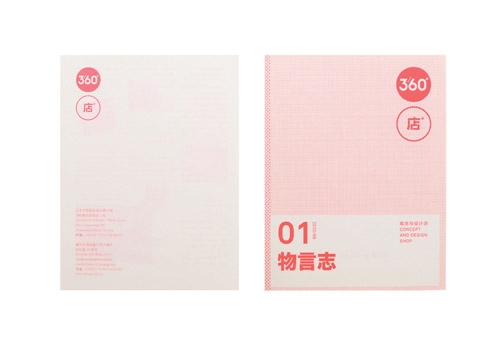
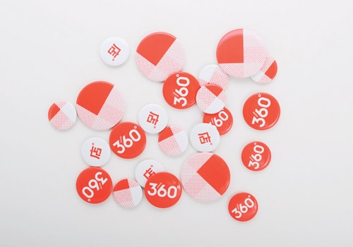
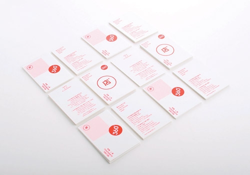
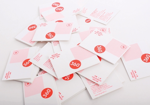
The shop identity is the extension of Design 360, a circle consisted with the Chinese character ‘店’ (shop) is built next to the logo of the magazine, as a pair they reflects the consistency under the same brand. A fluorescent red was chosen as to convey a new style of contemporary China.
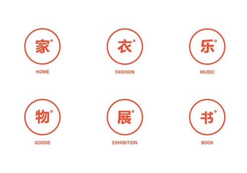
The way of categorizing the nature of products is synchronizing with the visual identity, with categories including ‘Home’, ‘Fashion’, ‘Music’, ‘Goods’, ‘Book' and ‘Exhibition’.
-
|
客戶:三度出版有限公司(中國廣州)/ 年份:2010-2012
廣州三度文化傳媒主理、從觀念與設計雜誌《Design 360˚》的意念衍生而成的「360˚店」設計概念店先後於2010年在北京798藝術區及於2012年在廣州紅專廠藝術區開業。
概念店以售賣亞洲設計師原創品牌為主,並不定期舉辦設計展和研討會,是新世代設計人才與各界交流的和推廣意念的平台。
「360˚店」品牌視覺形象設計由milkxhake負責,項目涵蓋命名、市場定位、營銷策略、視覺形象和包裝設計等。
概念店是雜誌的延伸,視覺形象也沿用圓形為主要形態,與雜誌標誌相配。紅色代表當代時尚中國,店的標識用上耀目的螢光紅色加上簡單有力的中文字體,清晰地把銷售產品分為六類,包括「家」、「衣」、「樂」、「物」、「書」及「展」。簡單的分類系統亦突顯了「360˚店」源於中國的特質。
|
|